The web moves quickly. As in blink and you’ll miss something. Somehow, WordPress has managed to maintain a steady presence in this environment.
The software still has a familiar vibe. As a longtime user, I know where to go to complete a task. And I thought I knew the Block Editor like the back of my hand.
However, a change in WordPress 6.6 had me scratching my head. I was training a client to use the editor. No sweat! I’ve done this a million times.
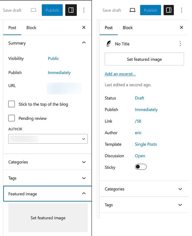
Little did I know the embarrassment coming my way. I was about to show them how to add a featured image to a post when…huh? Where is it? Is the site broken? I couldn’t find the setting in its familiar spot in the lower right panel.
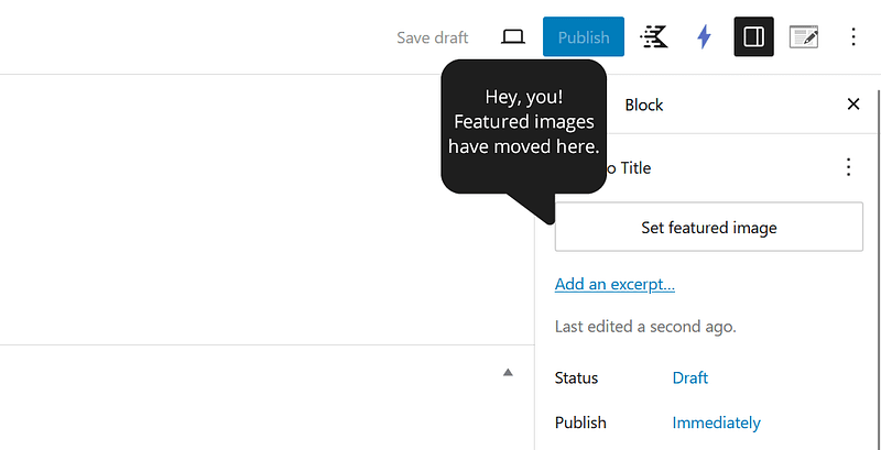
It turns out that the “unified publish flow” changed the position of the featured image dialog. It moved a few inches higher on my screen. It also looked a bit different than before.

Perhaps I’m not the most observant person. But I can’t be alone in being thrown off by this change. Right?
It’s proof that a relatively small user interface (UI) change can become a big deal. Let’s talk about how they impact us.
Just like Starting Over
Workflow is a sacred thing for many of us. It allows us to get things done more efficiently. It almost becomes second nature. We plow through tasks without thinking about them.
That’s why change is so difficult. My featured image faux pas was like having the rug pulled out from under me. I felt out of touch with the software I use daily.
This sort of change frustrates everyone. But web professionals may have the most to complain about.
Our clients and colleagues may be just as confused. And who do you think they’ll ask for help? Indeed, UI tweaks can lead to a lot of support requests. That’s extra time you probably didn’t account for.
And what if you provide documentation or tutorials? You’ll need to edit your content to reflect the new way of doing things.
There are already piles of outdated WordPress tutorials out there. Each UI change adds more to the dustbin of history.
Sure, we’ll eventually adjust. But these changes are another obstacle to navigate.
UI Changes Demonstrate the Need for Onboarding
I admit to not being a great student. I don’t often install WordPress betas or release candidates. My focus is on the hot new features – not the minutiae.
If only I did my homework. I would have known about the change to the featured image element. However, I bet that I’m in the majority here. How many end users do we expect to know about these little UI enhancements?
We need a better way to educate users. A simple onboarding dialog seems like a reasonable option.
WordPress still lags in this area. New users install the software and receive minimal direction.
The dashboard features a welcome box. Your first trip into the Block Editor offers a carousel. But other changes don’t get the same treatment.
If we’re going to disrupt a user’s day, we should at least provide a tooltip. Perhaps it would be a nuisance for some people. But it might also save us from some confusion.

Otherwise, we’re dropping people into the forest without a GPS. How are they supposed to find their way around?
A Change Is Only Positive When Communicated
None of this is to say these types of changes aren’t warranted. I appreciate any effort to create a more logical user experience. This one makes sense when I look at it from a distance.
The problem is the lack of communication. It’s not intentional. However, changing the UI without educating users is likely to backfire. It impacts WordPress and virtually every other piece of software.
Consider the perspective of a longtime user. I updated WordPress and, suddenly, cannot find the feature I’m looking for. It’s not in the same spot it’s been for years. I’m confused and frustrated.
Will I get over it? Absolutely. But it’s also hard to call this anything but a negative experience. Now, multiply this experience by the millions who use WordPress.
We can’t say we’ve made things better if we’ve made a user’s job harder – even temporarily.
The sad part is that we can’t see the hard work and thought that went into this change. Think of how a little communication could have shined a light on that instead. It should be something to celebrate.
An Opportunity for Improvement
This situation could have a positive outcome. The WordPress project can use this opportunity to improve. To rethink how UI changes are implemented and communicated.
Every software development team has had to learn this lesson. Even the likes of Microsoft have years of misfires to lean back on.
As an open-source app, WordPress faces a different sort of challenge. Contributors come and go. And not all of them work full-time on the project.
Perhaps some solid guidelines for introducing UI enhancements are worth exploring. A way to make the software better and educate users. That benefits everyone.
In the meantime, I now know how to add a featured image to my posts again. I’m feeling good about my WordPress knowledge – until the next change!
Join The Newsletter
Get your favorite 5 minutes of WordPress news for busy professionals every week — 100% Free! Join the WP Minute Newsletter below 👇


