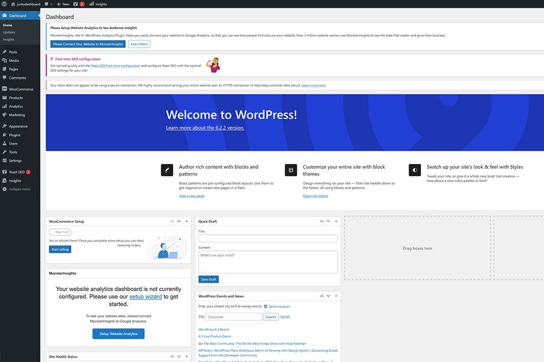
Let’s be honest: the WordPress dashboard is a mess. The world’s most popular content management system (CMS) is wonderful. But its back end is weighing it down. Where do I even begin?
First, there’s clutter. Plugin and theme developers litter the landscape with notifications. Most are of questionable value. And no, I don’t want to install your list of recommended plugins.
Visiting various admin pages offers an alphabet soup of user interfaces (UI). The Block Editor looks nothing like the rest of WordPress. Neither does the Site Editor. But plugins are once again the biggest offenders. The major players all have bespoke design languages.
And what if you want to browse existing site content? The WordPress page and post listings are a relic of the past. Finding a specific item can be a frustrating experience.
I think we’ve only scratched the surface. The WordPress dashboard needs some love. How could it be improved? We’ll also talk about the good news on the horizon.
The ‘Home’ Screen Is a Missed Opportunity
I recently asked WordPress users on Twitter (or ‘X’, or whatever Elon feels like calling it) which area of the dashboard they rarely (if ever) visit. Surprisingly, multiple people replied with the Home screen.
Technically speaking, the Home screen is the first thing you see when logging in. Therefore, I’m guessing that users are seeing it. But perhaps they’re simply not paying attention to what’s there.
WordPress core does provide useful information here. There are widgets for checking your site’s health, a rundown of content, and a way to manage comments (if you use them). And new installations feature an onboarding widget to help users get started.
This page is also host to scores of theme and plugin-related widgets. There are sales pitches and recent blog posts from third parties. You’ll occasionally find data as well. WooCommerce provides site sales information, for example.
The Home screen is a collage of ads and info. Users can choose which widgets to display. But it becomes a chore to maintain. And it’s fair to wonder how many of these items are of any interest to users. Maybe that’s why people tend to skip past the page.
There’s so much potential for this screen. It starts by adding relevant site data. A way to navigate to a specific piece of content would also be welcome. Limiting the types of information third parties can include might also be beneficial.
Polish the Page and Post Listings
A WordPress website is capable of hosting a lot of content. A large site could have thousands of posts – or more. It’s one of the strengths of the app.
But the more content you have, the messier the page and post listings become. Pages are particularly frustrating. They can have parent-and-child relationships. And that can result in a cluttered mess to navigate in the back end.
Finding the content you want to edit is often a slog. WordPress core includes the ability to sort content by various columns. And there is a search feature. But both are painfully slow to work with.
This is a perfect opportunity to put JavaScript to use. The Block and Site Editors use the React framework. These screens could also benefit from it as well. It would bring a “live” search capability. Content would be much easier to find.
A fresh design would also help. The listings could make more efficient use of the available space. Adding more whitespace around items would open up the UI.
A Settings API That Developers Like
The WordPress Settings API aims to bring consistency to the dashboard. It serves as a way for developers to create settings pages that look and work similarly to the core software. And many products have taken advantage.
But it seems that most big players have left the Settings API behind. Visit the settings pages for WooCommerce, Yoast SEO, or Advanced Custom Fields. Each has a unique look and feel.
The result is that users must learn multiple design patterns. Navigation works differently. And even simple elements like buttons can look wildly different. Each settings screen is like visiting a separate world.
So, why do developers eschew the Settings API? For one, it sports a very bland look. There aren’t many branding opportunities. Thus, some product makers find that it doesn’t match their needs.
A more modern set of features and styles could get developers on board. That wouldn’t prevent over-the-top designs. But it may bring some sanity to an otherwise chaotic place.
Just think of what a flexible design language could achieve. WordPress settings could look every bit as modern as their competitors. Being completely uniform may be too much to ask, though.
An Overhaul Is around the Corner
Now for some good news. Phase 3 of the Gutenberg project includes references to a dashboard overhaul. And some recent blog posts point to specifics about what’s to come.
It’s an opportunity to rethink what the dashboard is and should be. The way we use WordPress has changed. And it’s been a long time since the dashboard was a focus. There’s now a path to modernize it.
That’s why user feedback is critical. It will help the project leadership identify pain points. They can use this knowledge to improve the user experience.
The WordPress dashboard may be a mess. But it doesn’t have to be. Let’s hope for some positive change soon.
Join The Newsletter
Get your favorite 5 minutes of WordPress news for busy professionals every week — 100% Free! Join the WP Minute Newsletter below 👇


